I
n this blog post, I have shown the steps for creating the expand-collapse gallery control in Canvas App.
I
n this blog post, I have shown the steps for creating the expand-collapse gallery control in Canvas App.
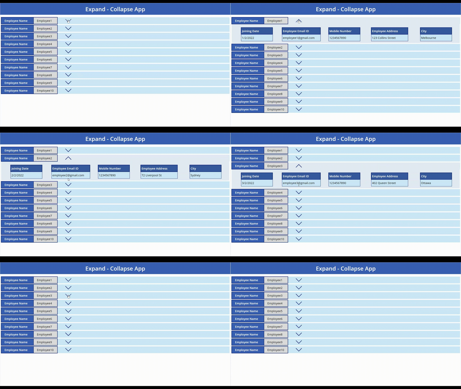
Now, let’s start building the gallery, for which we would have to create out list first and have the same loaded in a PowerApps App as a data source.
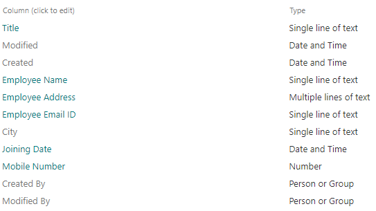
Step 1 – Create “Expand-Collapse Control” list with the following columns and their types.
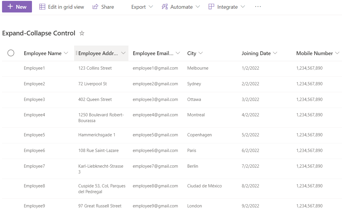
Step 2 – Add entries in “Expand-Collapse Control” list
Step 3 – Create canvas app and name it “Expand-Collapse App”
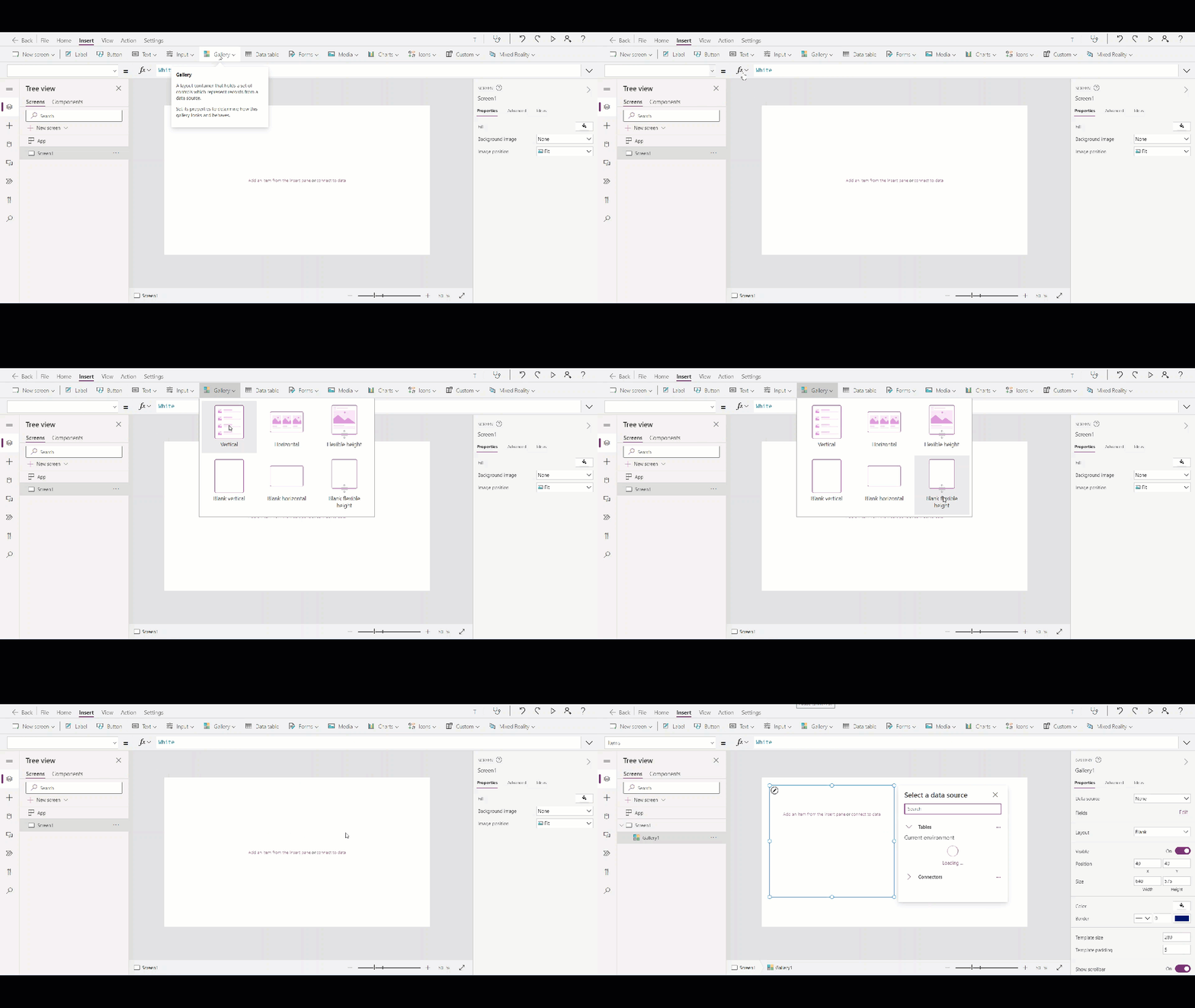
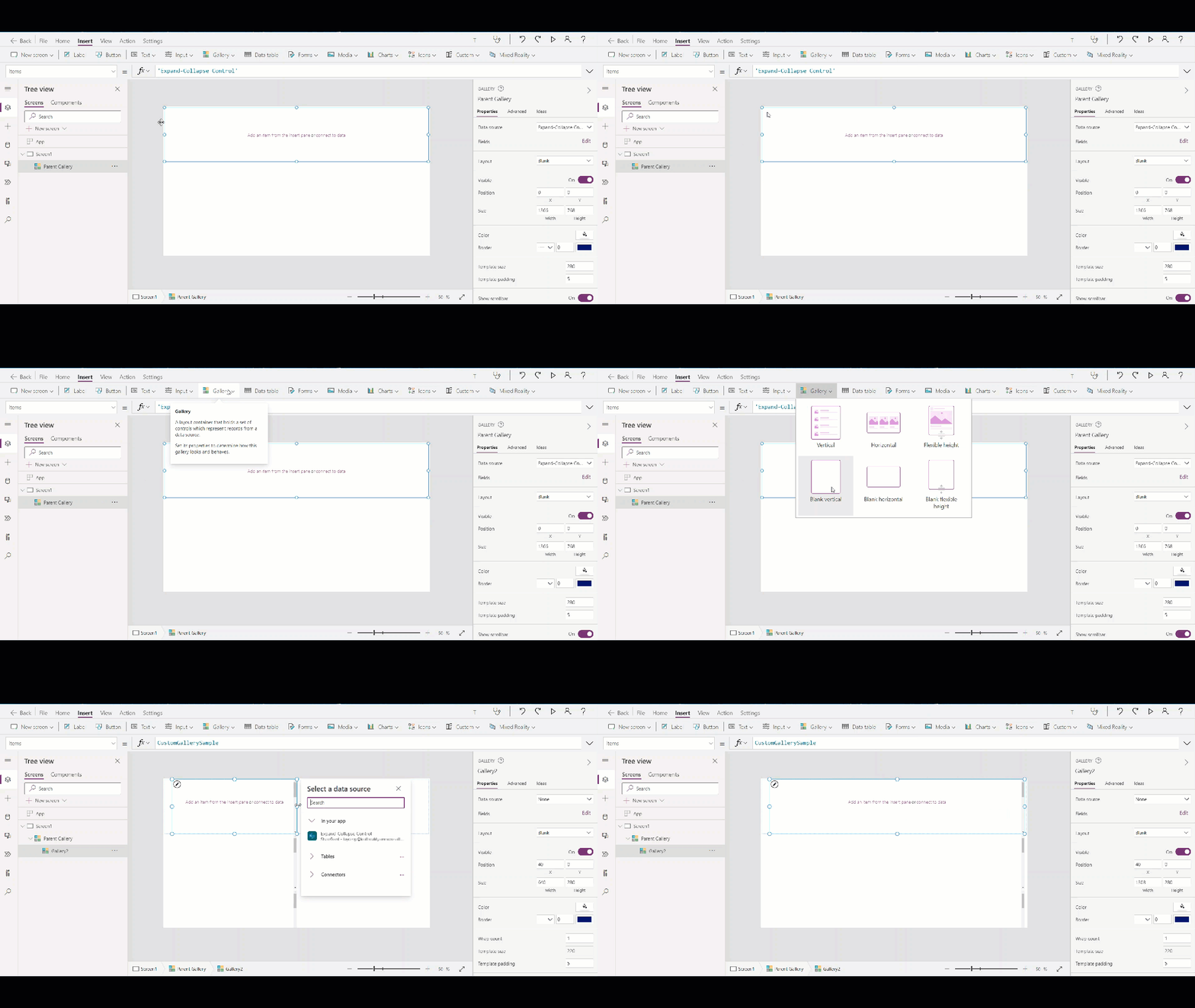
Step 4 – Adding the data source to Gallery
In Parent Gallery add “Expand – Collapse Control” list data
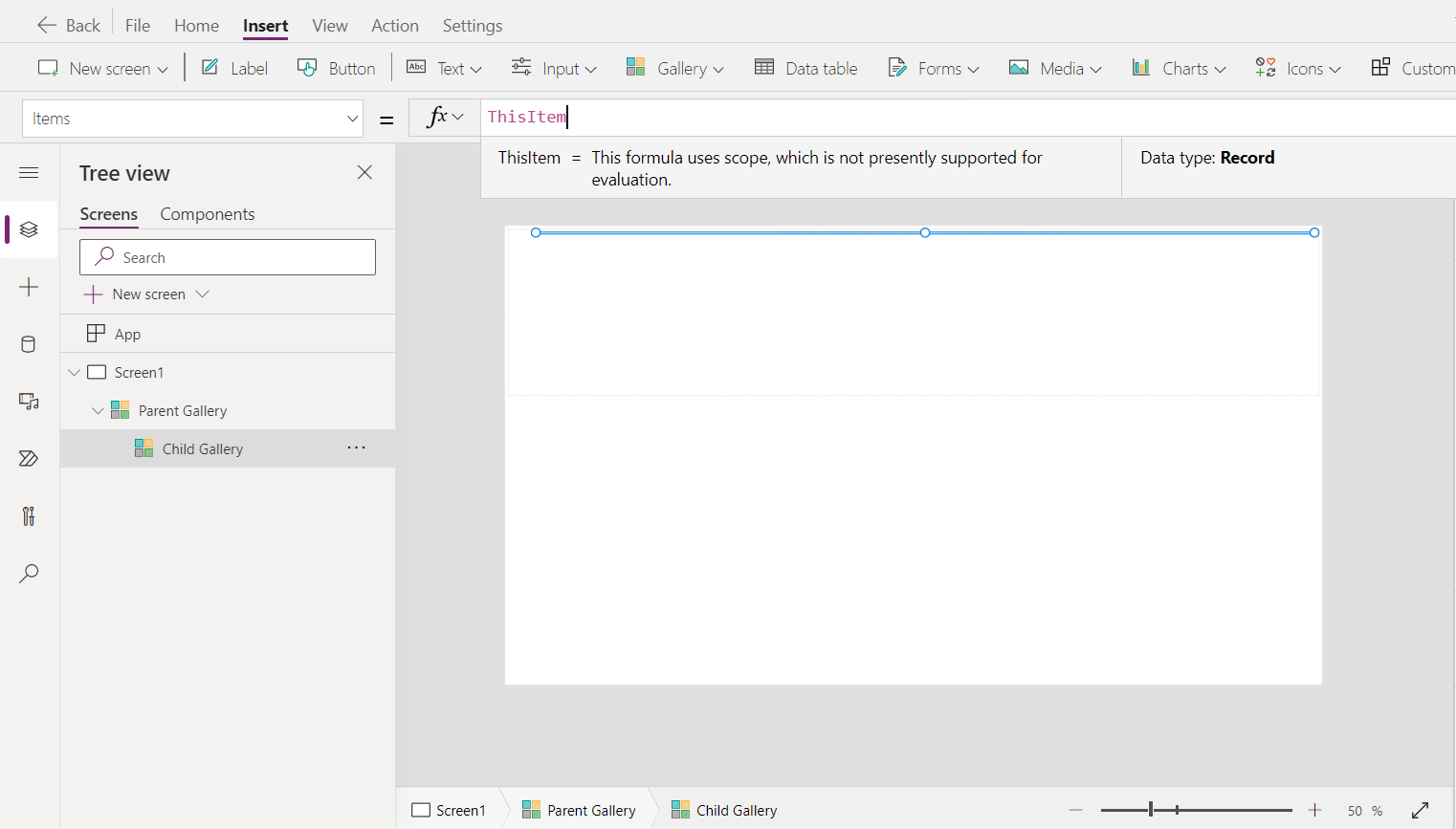
For Child Gallery in “items” property add code – ThisItem
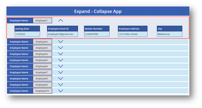
Step 5 – Add labels according list’s columns and add show data
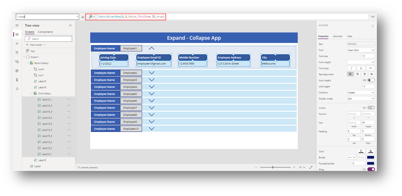
Step 6 – Add code on all label’s “visible” property which are added in “Child Gallery”. Also, to have the Child Gallery show when button is clicked, we have to add code in Child Gallery’s on “Visible” property
“Visible” property – Switch(varShowId,0,false,ThisItem.ID,true)
Step 7 – Add down arrow icon and up arrow icon.
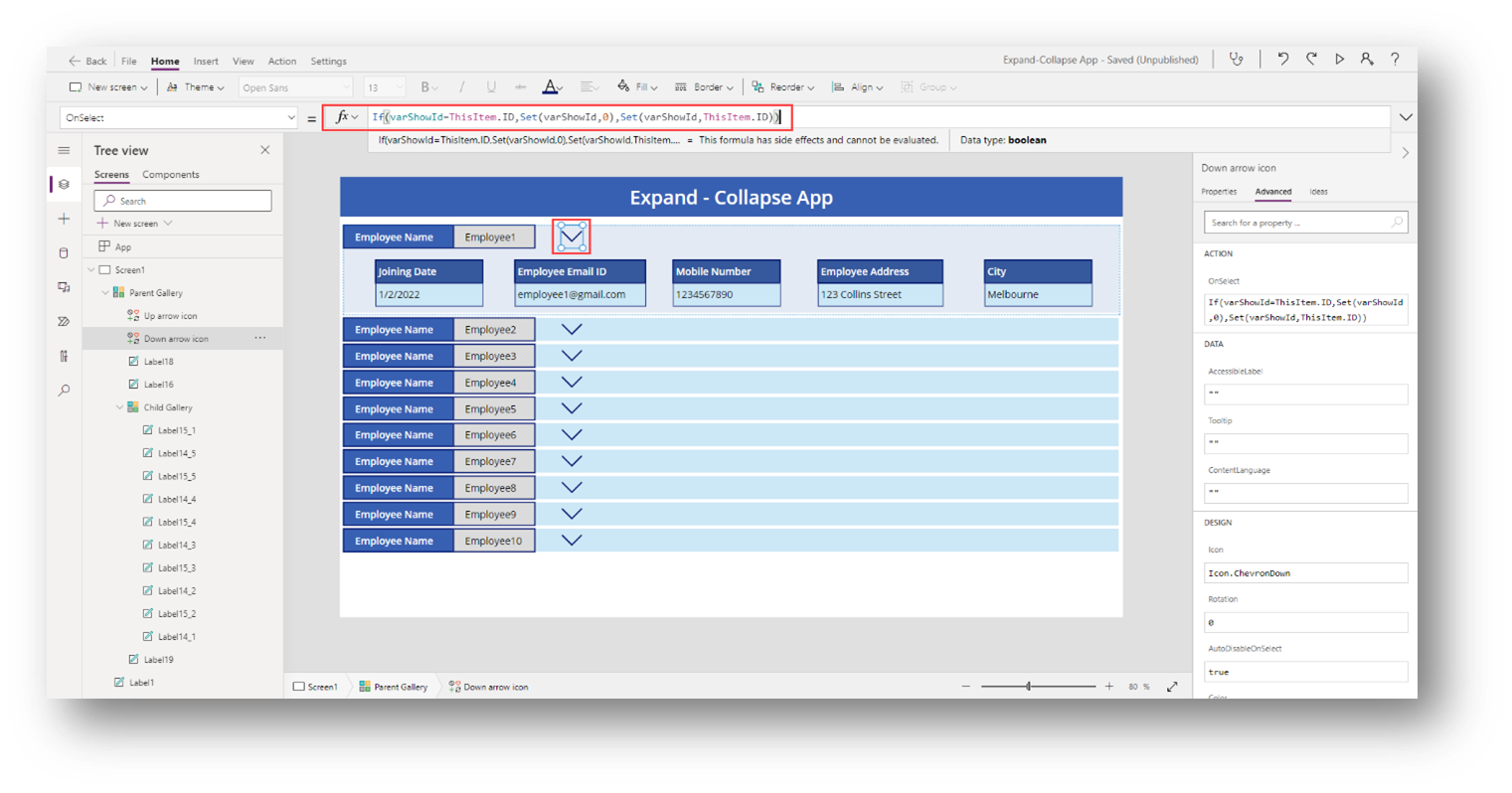
Then first write code on down arrow icon(Down arrow icon) it’s “OnSelect” property – If(varShowId=ThisItem.ID,Set(varShowId,0),Set(varShowId,ThisItem.ID))
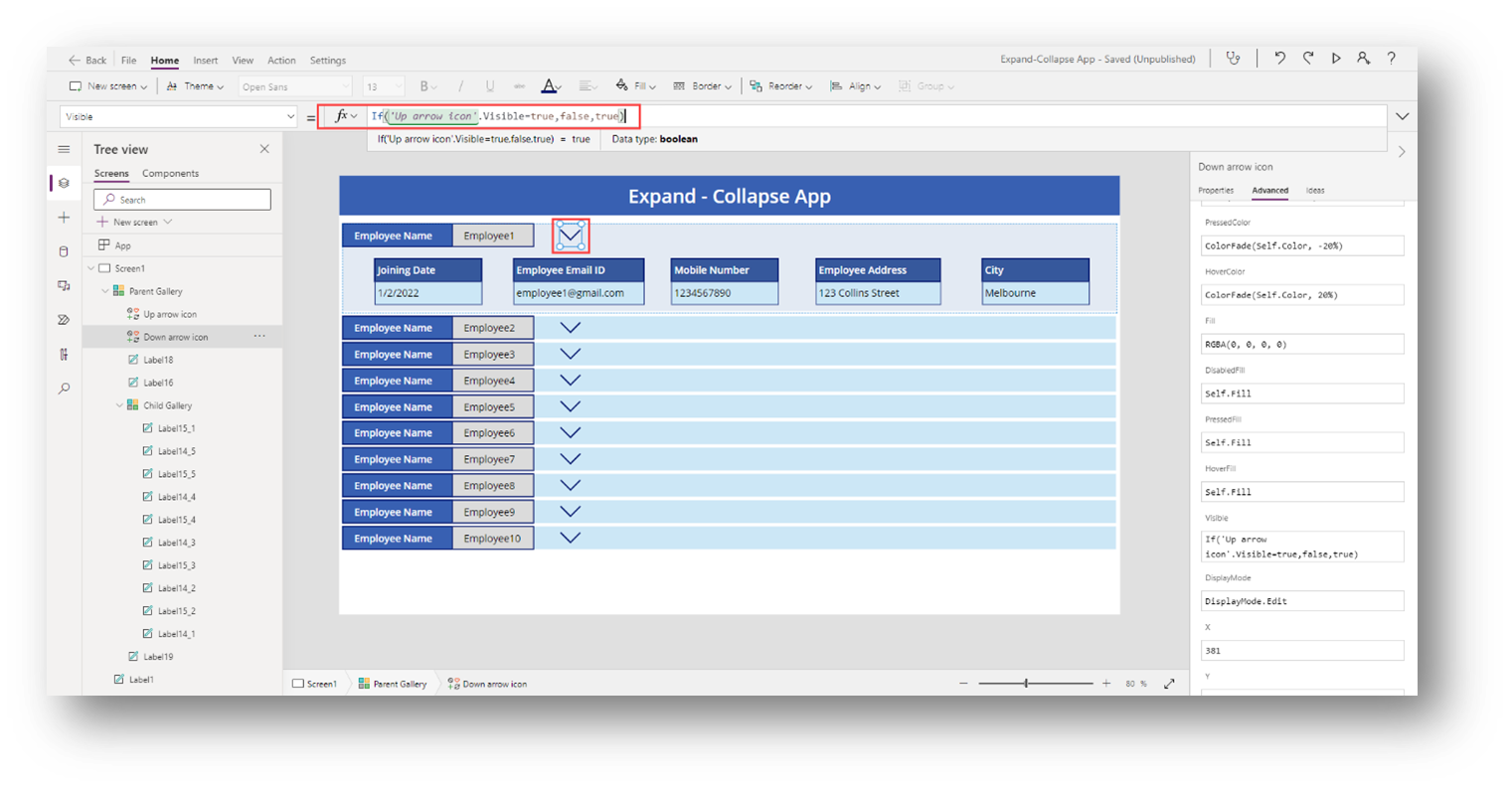
And add code on visible property – If(Up arrow icon.Visible=true,false,true)
Step 8 – On the down arrow icon and write code on it’s “OnSelect” property – If(varShowId=ThisItem.ID,Set(varShowId,0),Set(varShowId,ThisItem.ID))
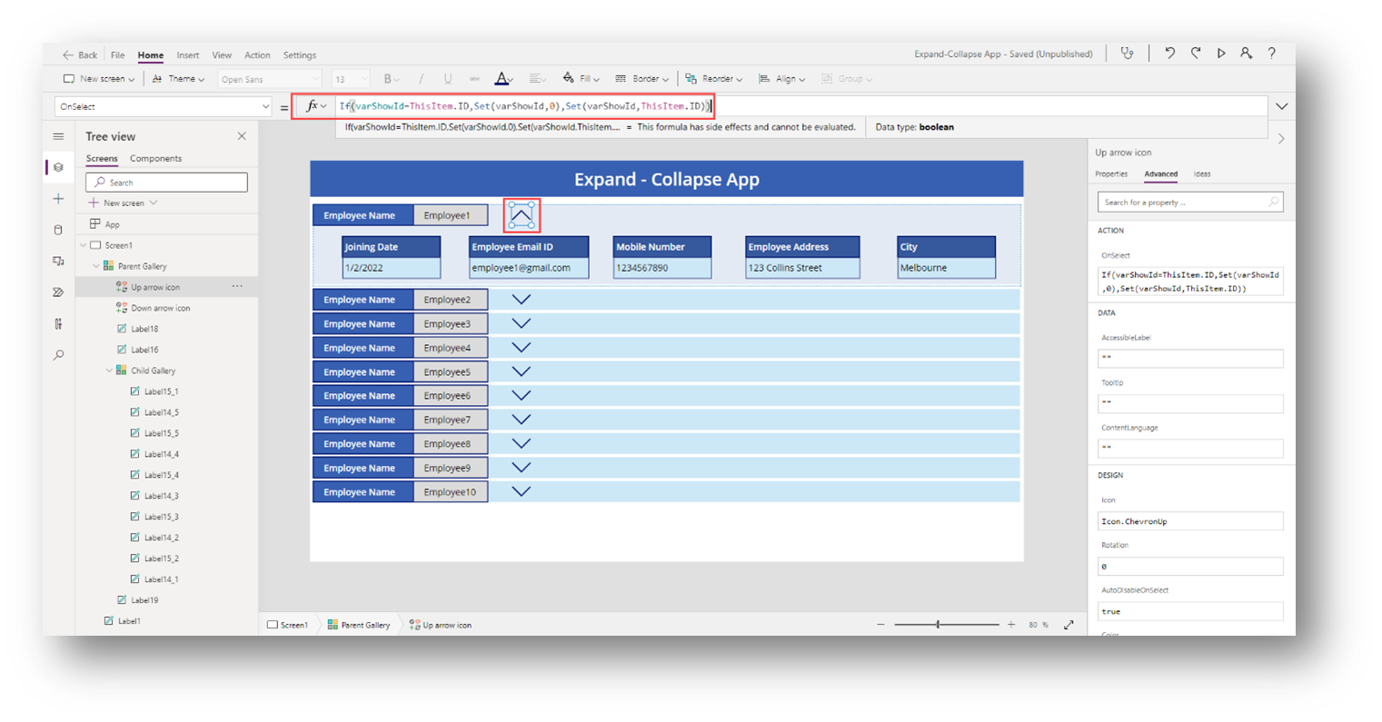
And write code on it’s “Visible” property – Switch(varShowId,0,false,ThisItem.ID,true)

That’s all,
We have finally created the collapsible Gallery control in Power App.
Hope this helps!!
Thank you,
Jaydeep Patel